Dyver
Profile Page Case Study
A deep dive into the evolution of the Dyver profile page - from concept to MVP to how the page has expanded.
Project Background:
Dyver is a mobile app designed for divers to log their dives, share photography, and connect with the global diving community. The platform combines social features with practical dive tracking tools, aiming to create a hub for exploration and storytelling around underwater experiences.
Project Timeline:
4 months for full MVP, 1 month for the profile page expansion
My Role:
I joined Dyver as the Product Designer tasked with designing the MVP. Designing the profile page was part of both my hiring process and my early contributions to the product. I owned the end-to-end design process - from research and ideation to creating high-fidelity designs, usability testing, and iterating on improvements.
Collaboration:
-
Dyver founder/Developer (for product vision, ensure feasibility and handoff)
-
Visual Designer (for brand vision and product design assistance)
-
Beta users (for usability testing and A/B testing feedback)
Tools Used
-
Figma – wireframes, design system management, high-fidelity UI design, and prototyping
-
FigJam – ideation and brainstorming, journey mapping, and collaborative feedback,
-
Slack – async collaboration with the team
Outcome:
The MVP profile page evolved through user testing into a more accessible, data-rich experience that now serves as the design foundation for Dyver’s social and future dive-mapping features.

Project Process
01.
Concept: A Story of How I Got the Job
02.
The MVP
03.
Enhancing the Profile Page
04.
Next Steps
01.
Concept: A Story of How I Got the Job
Through fast research and brand-aligned iteration, I translated strict requirements into a profile page concept that reflected what divers care about most.
The Challenge: Getting Hired as Part of the Interview Process
I was given brand guidelines (typography, logo, color palette, mood board) and specific constraints and requirements specifically for the profile page. That included:
-
Basic information: (Name, profile picture, location, bio
-
Highest Certification + a way to navigate to other certifications
-
Following/Follower counts
-
Dive Stats: # of dives, deepest dive, longest dive
-
A reverse chronological feed - not the focus but considered in the design
Taking a Deep Dive into Scuba
I knew almost nothing about Scuba going into this project. But as an endurance athlete, I could understand the passion behind pursuing the sport. I could also relate to the gear, gadgets, and data associated with scuba diving coming from sports that were also data-heavy. But to design a profile page that resonates with core users, I needed to understand who scuba divers were.
Before jumping into design, I did secondary research to understand:
-
Who are the potential users and demographics of certified scuba divers?
-
What are the various scuba diving certifications and how this could impact design?
-
How are divers currently logging their dives?
I also conducted competitive research across dive log and social platforms to understand the existing landscape, identifying strengths, gaps, and opportunities that could inform a more intuitive and compelling solution.
To get into the details, check out the presentation I put together for the Dyver team that inevitably got me hired:


02.
The MVP
...And why I decided to jump into onboarding first.
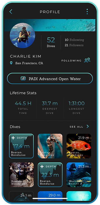
Refining the Profile Page for the MVP
The profile page I designed for the design challenge was a solid base for the next step in our iterative process. With full access to branding assets, iconography, and early components, I worked with our Visual Designer to build out our design system.
We refined my initial concept to align more closely with the brand vision, iterating through multiple layout and interaction ideas before landing on the MVP direction. Along the way, we introduced playful elements, such as the tappable certification badges and the clean lifetime-stats row, which instantly communicates each diver’s experience level and identity within the community.


Beta Testing
Before we launched Dyver to the world, we did beta testing on a group of 20 divers in Bonaire in the Caribbean. We encouraged our divers to create profiles, upload dives, and engage with each other on the app.
After a few days of use, I ran a usability workshop to understand user pain points and identify changes we could implement before launching Dyver in the app store.
A key insight from testing was that our 10px grid system created readability and tap-target issues, especially on larger screens where the interface felt cramped and overly dense.
We expanded the grid to 12px to enhance visual clarity, touch accuracy, and overall comfort. This adjustment gave the layout more breathing room and created a cleaner, more accessible experience.
03.
Enhancing the Profile Page
A year after the first beta trip in Bonaire, we A/B tested four feed concepts to learn how divers prefer to view and interact with dive logs directly on the profile page.

A/B Testing the Feed
We did not include a feed in the user's profile page in the MVP. Users could access their dive log by using a button on their profile page or by visiting the Dyver feed.
Goal: We want to explore how divers would prefer to view and interact with their dive logs and photos if it were embedded into the profile page.
We tested four variations:
-
Timeline feed – straightforward but felt dated and less engaging (Strava)
-
Instagram-style grid – familiar and intuitive, highlighting both photography and dive data.
-
“Dive Trips” Hotspots mapping experience – interactive dive site mapping, exciting but complex to integrate on a short timeline.
-
Photo journal collage
Results
Users had two preferences - the “dive trips” version with a visually engaging feed and hotspots was by far the favorite, but the least feasible in the short term.
Users also liked the grid-style experience (familiar, easy to navigate, visually engaging).
Reflection: While the mapping concept tested well in theory, it wasn’t feasible for a quick turnaround. We moved forward with the grid-style feed because it allowed us to balance engineering constraints with user expectations.


04.
Next Steps
The future of the Dyver feed and where we go from here.
Building to the Future
What’s next:
-
Develop the hotspots mapping experience further (biggest long-term opportunity).
-
Expand mapping and dive site exploration features, making Dyver not just a logbook but a community-driven dive discovery platform.
-
Continue to riff on the "Dive Trips" vision.
-
Expanded capabilities for Freediving and Snorkeling.
Vision:
Evolve the profile page from a static log to an interactive hub for dive experiences.


